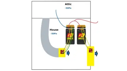
Part 5 of our 5-part series looks at how the data can be graphed and what other options are available.
In the fifth and final installment of Retrotec’s FanTestic software tutorial series, the focus shifts to interpreting test results through graphical displays and exploring additional configuration options available within the software.
Exploring Graphical Data
FanTestic presents test data visually in real-time, allowing users to:
Track pressure vs. airflow curves during multi-point tests
Identify anomalies or inconsistencies as they happen
Compare actual results against target pressure setpoints for enhanced clarity
These visual tools help diagnose unexpected behavior—like abrupt pressure drops or erratic flow—which might indicate leaks, unstable fan performance, or instrument errors.
Extra Software Functions
Beyond graphing, this video highlights additional features to optimize testing, including:
Customizable test parameters: Adjust pressure ramp rates, data capture intervals, and fan response profiles
Report enhancement options: Choose which graphs appear in exports, tailor report headers and data tables, and adjust formatting
Data export flexibility: Generate ready-to-share PDFs or raw data files (Excel/CSV) for further analysis or archival
Why these Features Matter
Enhanced troubleshooting: Visual feedback makes it easier to catch and correct issues mid-test
Professional reporting: Customizable visuals and formatting help communicate results to clients or regulators
Improved audit reliability: Exportable data ensures transparency and traceability for compliance or quality-control purposes